In today's data-driven world, the ability to transform raw numbers into compelling visual narratives is invaluable. Hanna Prodigy Visual Architect excels in this domain, offering a sophisticated suite of visualization tools that can bring your data to life. Let's explore how Hanna can help you tell your data stories effectively.
These are all the graphics that Hanna prodigy offers, which are automatically generated and dynamic—you can interact with them. In most cases, you don’t need to specify the chart type—Hanna will determine the most suitable option based on your prompt. However, if you have a specific chart type in mind, be sure to indicate it clearly.
Interactive Features
- Responsive design adaptation
- Customizable tooltips
- Interactive legends
- Brush selection capabilities
- Auto-resize functionality
Best Practices
When working with Hanna Prodigy Visual Architect, consider:
- Being specific about your data requirements
- Mentioning any color schemes or branding guidelines
- Specifying interactivity needs
- Indicating the target audience for your visualization
These are the charts available in Hanna:
Generally used charts
Simple Line Chart
Purpose: Perfect for showing trends over time or continuous data sequences.
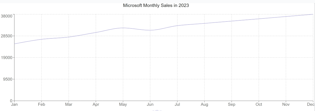
When to use: Tracking sales growth, temperature changes, or any time-based progression.
Example Prompt: " Create a line chart showing monthly sales for Microsoft in 2023"
Customized Dot Line Chart
Purpose: Enhanced version of line charts with emphasized data points.
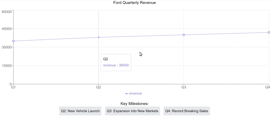
When to use: When specific points in your data need extra attention or detail.
Example Prompt: " Generate a dot line chart for quarterly revenue with highlighted key milestones for Ford"
Simple Bar Chart
Purpose: Comparing quantities across different categories.
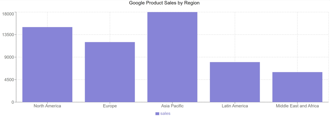
When to use: Comparing sales across products, departments, or regions.
Example Prompt: "Show me a bar chart of product sales by region for google"
Stacked Bar Chart
Purpose: Showing composition within categories while comparing totals.
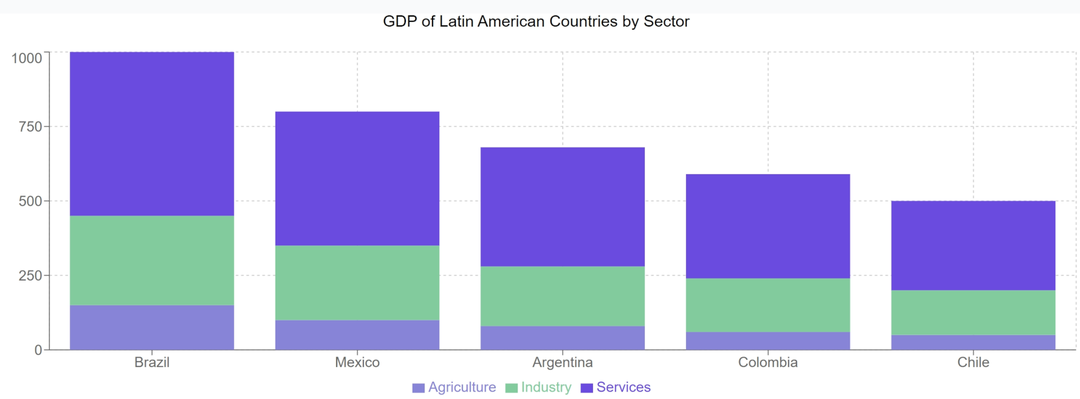
When to use: Breaking down revenue sources for different departments.
Example Prompt: "Create a stacked bar chart showing the GDP for several countries in Latin America"
Simple Area Chart
Purpose: Emphasizing volume while showing trends over time.
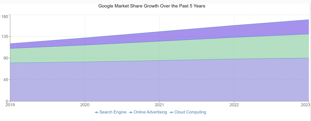
When to use: Displaying market share evolution or cumulative growth.
Example Prompt: "Generate an area chart showing market share growth over the past 5 years for Google"
Stacked Area Chart
Purpose: Visualizing multiple time series data showing both individual contributions and total accumulation over time.
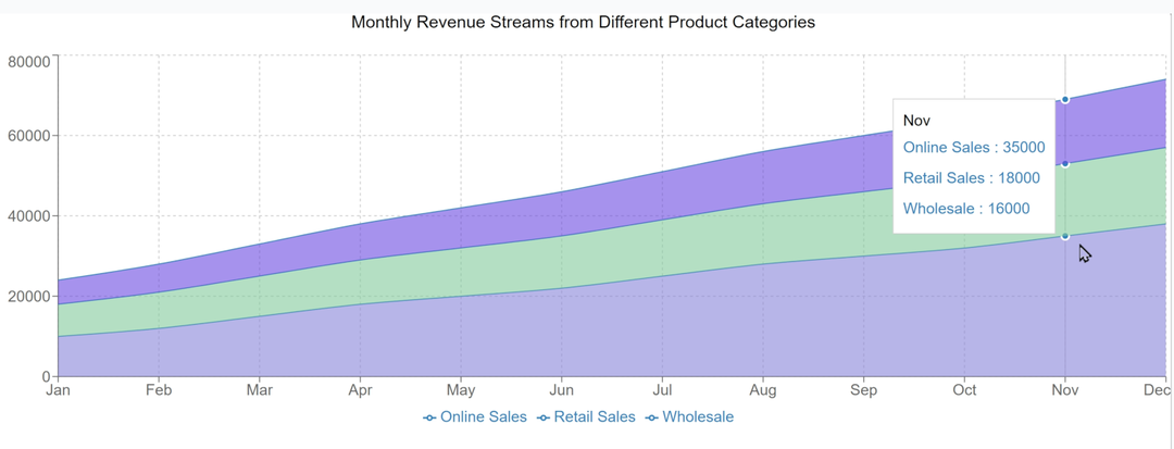
When to use: Perfect for showing how different components contribute to a total while also displaying the trend over time.
Example Prompt: "Create a stacked area chart showing monthly revenue streams from different product categories over the past year, including online sales, retail sales, and wholesale"
Advanced Visualization Features
Basic Pie Chart
Purpose: Shows parts of a whole through circular segments
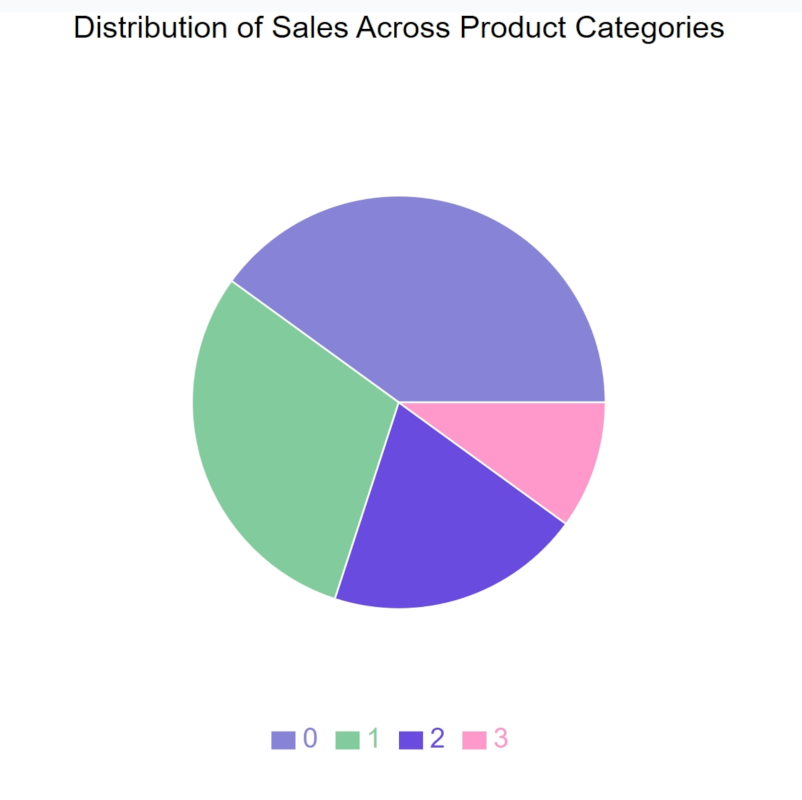
When to use: For displaying composition data where parts sum to a meaningful whole, like market share or budget allocation
Example Prompt: "Create a pie chart showing the distribution of sales across our product categories"
Enhanced Label Pie Chart
Purpose: Pie chart with detailed segment labels showing values and percentages
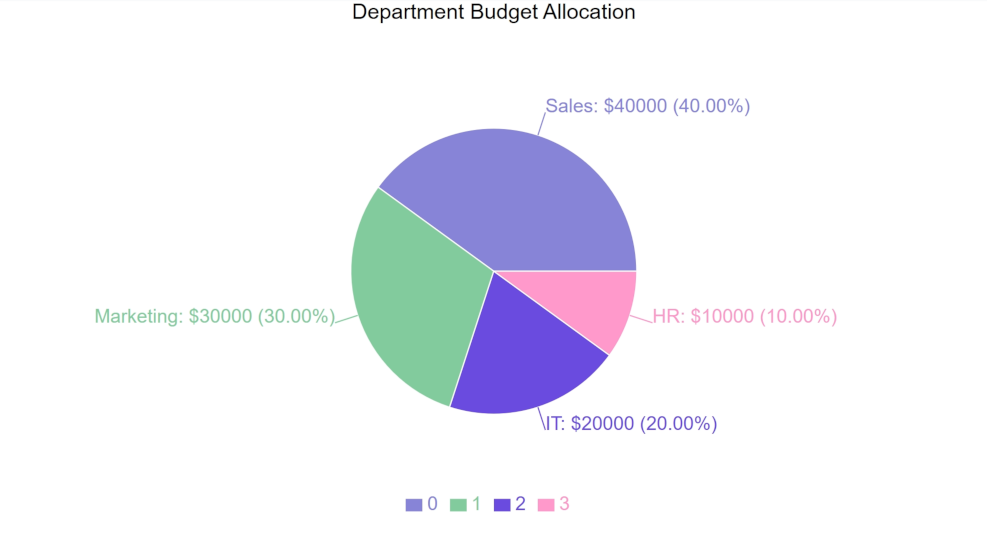
When to use: When precise values and proportions need to be clearly visible alongside the visual representation
Example Prompt: "Generate a pie chart with detailed labels showing department budget allocation with exact amounts and percentages"
Spider Chart (Radar Chart)
Purpose: Displays multivariate data across multiple axes starting from the same center point
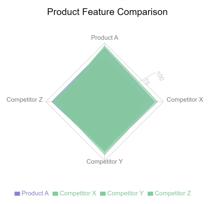
When to use: Comparing multiple variables or performance metrics across different categories
Example Prompt: "Create a spider chart comparing our product's features against three competitors"
Circular Progress Chart (Radial Bar)
Purpose: Shows progress or completion metrics in a circular format.
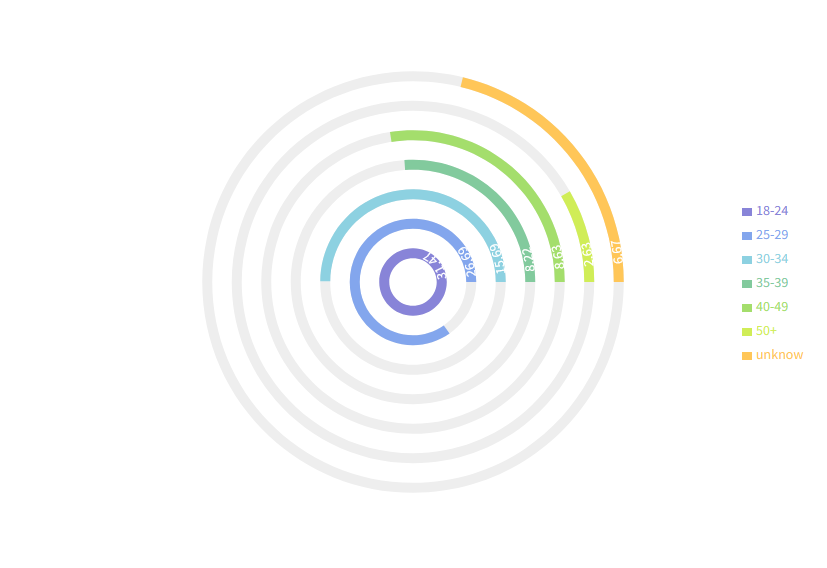
When to use: Displaying goal completion, performance metrics, or progress indicators
Example Prompt: "Show me a circular progress chart of each team's target achievement for 2024"
Correlation Plot (Scatter Chart)
Purpose: Shows relationships between two variables
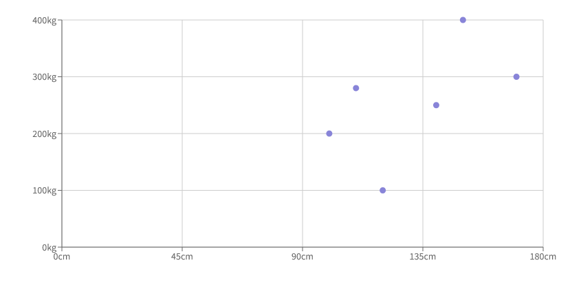
When to use: Analyzing correlations, trends, or patterns between two metrics
Example Prompt: "Create a correlation plot comparing customer spending versus satisfaction ratings"
Multi-Dimensional Scatter (Bubble Chart)
Purpose: Displays relationships between three variables using position and size
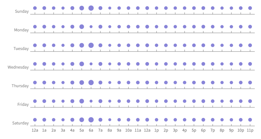
When to use: When analyzing three related metrics simultaneously
Example Prompt: "Generate a bubble chart showing product sales (size) against price (x-axis) and customer rating (y-axis)"
Speecialized Chart Types
Hybrid Chart (Composed Chart)
Purpose: Combining multiple chart types in one visualization.
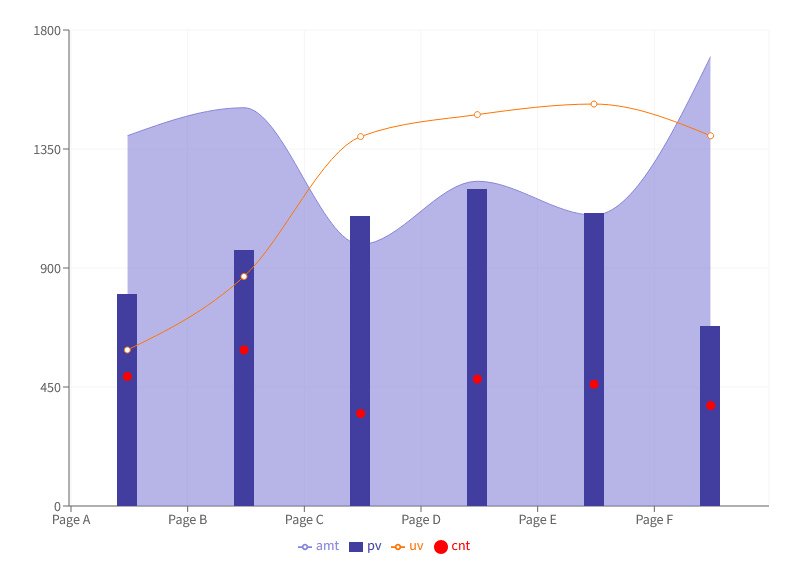
When to use: Complex data stories requiring multiple visualization methods.
Example Prompt: "Create a composed chart showing revenue as bars and profit margin as a line"
Annotated Trend Line (Customized Label Line Chart)
Purpose: Line chart with custom labels at specific data points
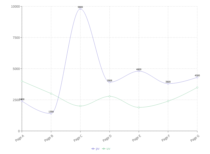
When to use: When specific points in a trend need detailed explanation or emphasis
Example Prompt: "Create a trend line with labeled annotations for key business events affecting our growth"
Micro Visualizations
Highlighted Points Chart (Customized Dot)
Purpose: Chart emphasizing specific data points with custom markers
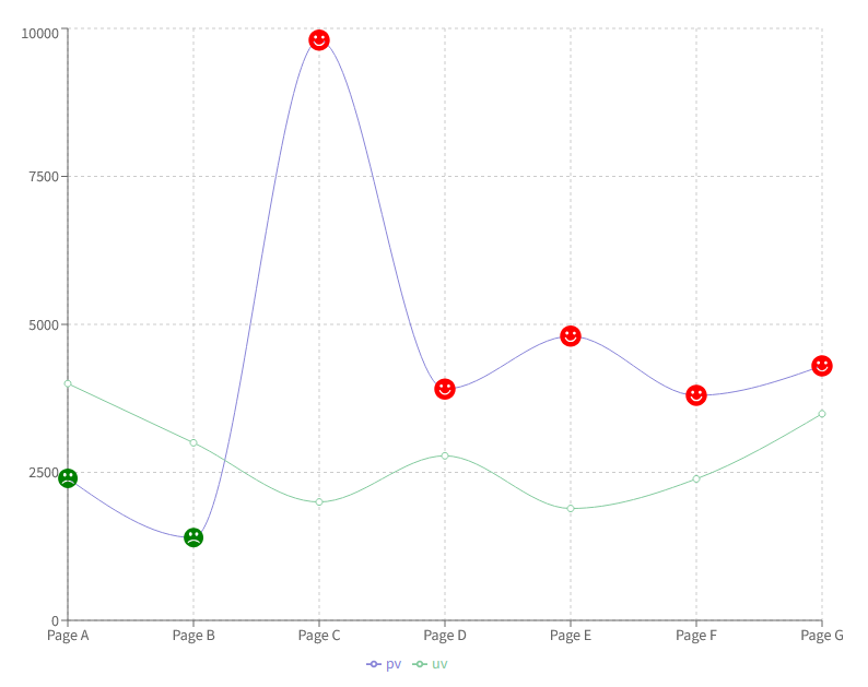
When to use: When certain data points need special attention or visual distinction
Example Prompt: "Generate a line chart with highlighted points for sales exceeding target values"
Dual Scale Chart (BiaxialLineChart)
Purpose: Shows two different metrics with different scales on the same chart
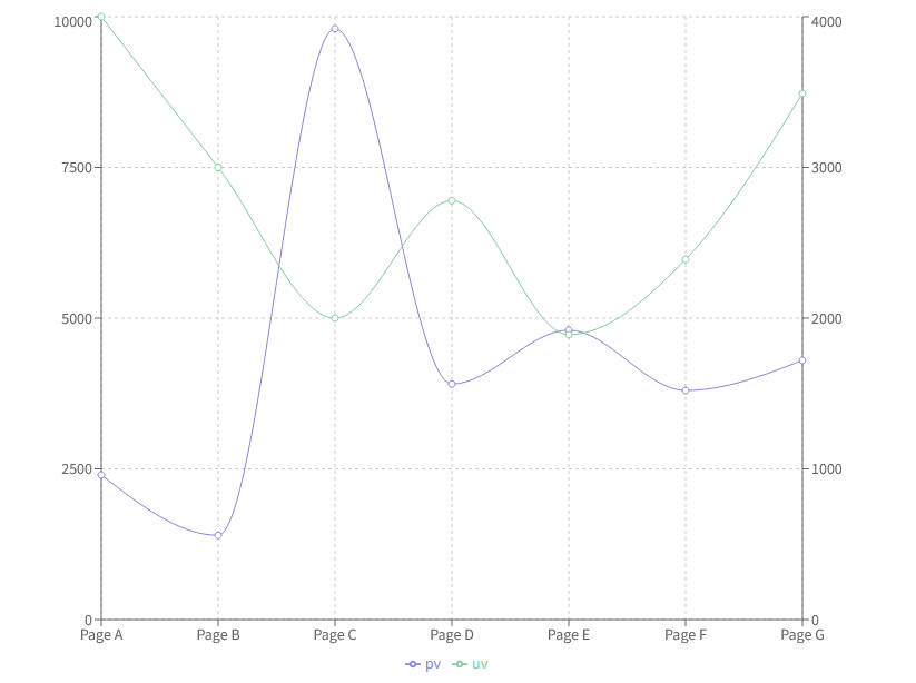
When to use: Comparing metrics with different units or scales, like quantity versus percentage
Example Prompt: "Create a chart showing sales volume and profit margin using two different scales"
Advanced Visualization Techniques and Special Applications
Mixed Bar Chart
Purpose: Shows different types of bars (grouped, stacked) in one visualization
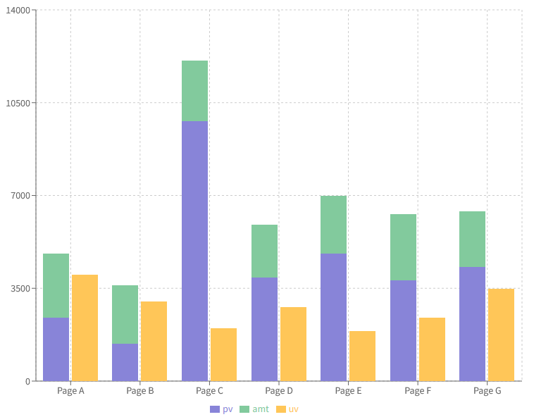
When to use: When comparing multiple metrics with different visualization needs
Example Prompt: "Generate a combined bar chart showing revenue streams and growth rates"
Tiny Line Chart
Purpose: Compact line chart for space-efficient trend display
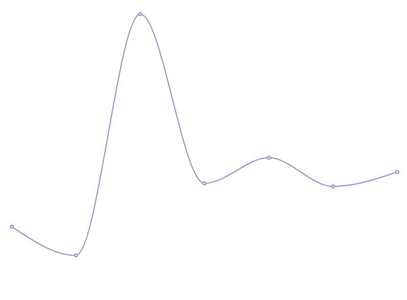
When to use: In dashboards, cards, or anywhere space is limited
Example Prompt: "Show me a mini trend line of daily active users for the sidebar"
Tiny Bar Chart
Purpose: Compact bar chart for quick comparisons
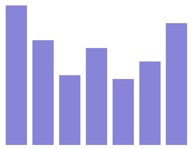
When to use: Quick comparisons in limited space, like in tables or cards
Example Prompt: "Create a mini bar chart showing weekly performance metrics"
Tiny Area Chart
Purpose: Compact area chart for showing volume trends
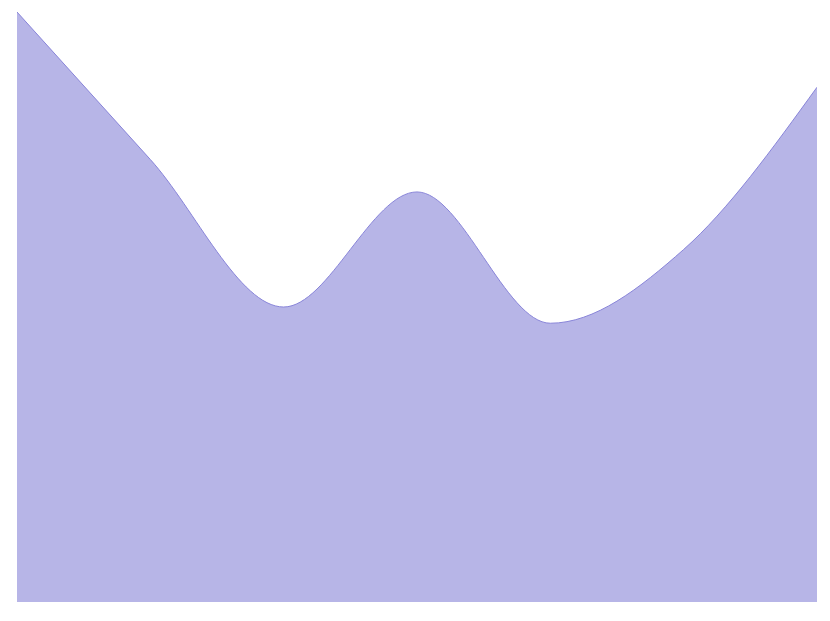
When to use: Small-space visualization of cumulative or volume data
Example Prompt: "Generate a mini area chart showing storage usage over time"
Percent Area Chart
Purpose: Area chart showing relative proportions over time
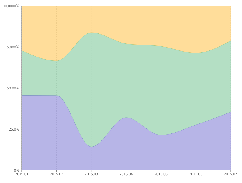
When to use: Displaying changing compositions or market share over time
Example Prompt: "Create a proportional area chart showing market share evolution by product"
Spaced Segment Pie Chart (PieChartWithPaddingAngle)
Purpose: Creates clear visual separation between pie segments using padding angles
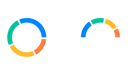
When to use: When you need to emphasize individual segments or improve readability of smaller segments
Example Prompt: "Create a pie chart with spaced segments showing department budget allocation"
Pie Chart with Customized Active Shape
Purpose: Enhances selected pie segments with custom animations or visual effects when interacted with
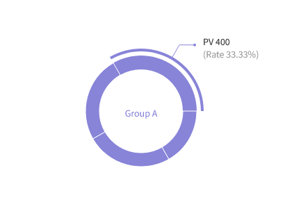
When to use: When you want to provide detailed exploration of specific segments through user interaction
Example Prompt: "Generate a pie chart where segments expand on hover to show detailed breakdown"
Brush Bar Chart
Purpose: Enables interactive selection and filtering of specific date ranges within the data
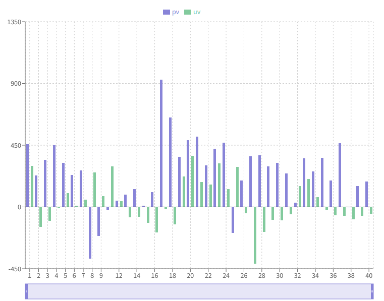
When to use: When users need to analyze specific time periods or compare different time ranges
Example Prompt: "Create a bar chart with a brush tool to select and analyze specific date ranges"
These specialized chart types offer enhanced functionality for specific use cases. The key is understanding your data presentation needs and choosing the visualization that best serves your audience's analysis requirements. Remember that many of these features can be combined to create even more powerful and intuitive visualizations.